Getting started
The kit ships as a token layer (Style Dictionary → CSS vars + Tailwind preset + Figma variables) and a React component layer built on Radix + native primitives.
Install
Section titled “Install”# tokens — CSS custom properties + Tailwind presetnpm i @operator-grade/tokens# components — React + TypeScript, Radix-basednpm i @operator-grade/reactImport the token CSS once at your app root, then wrap your app in ThemeProvider to set the active mode and direction:
import '@operator-grade/react/tokens.day.css';import '@operator-grade/react/tokens.night.css';import '@operator-grade/react/tokens.mono.css';import { ThemeProvider, Button } from '@operator-grade/react';
export default function App() { return ( <ThemeProvider theme="day" dir="ltr"> <Button intent="primary">Engage</Button> </ThemeProvider> );}The three modes
Section titled “The three modes”day (command-center dark), night (NVG-safe, low blue/green-biased), and mono (color stripped — meaning survives by shape/glyph). Set the mode with one attribute; everything re-themes.
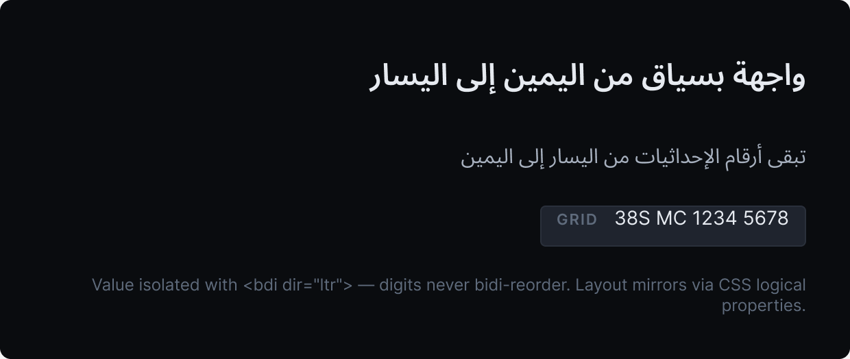
Coordinates and grid digits stay left-to-right via <bdi dir="ltr"> even in an Arabic (RTL) UI.